What's new
Status
Not open for further replies.
My preference still goes out to a menu that looks like the system menu with plain text:


It doesn't have any bells and whistles or any flash to it but it just seems to fit imo.
I quite like this as well, so clean :D
 
Ability to flag favourites would be a good shout - and I do like a pageable text list (up down single entry, left right page at a time) due to the high number of titles that can be stored on the cart. The graphical menu is ace - but not the most efficent :)

Setting a default game set to be loaded after power cycles would be handy as well!

Apologies for not re-reading all 80 pages, but does the cart save soft dip settings between power cycles per title?

#Wonderdog
 
I love the current menu. And some kind of whatever for view favorite games should be mandatory.
 
Read about bikeshedding here:

en.wikipedia.org/wiki/Law_of_triviality
lol. that's a quick one rtw :thumbup:
fHwBj5V.gif
 
It's not bad Darksoft, however, we need to be able to jump ahead like 5-10 games at a time or something like that so maybe U/D goes 1 game and L/R goes 10 or something. Can that happen?
 
It's not bad Darksoft, however, we need to be able to jump ahead like 5-10 games at a time or something like that so maybe U/D goes 1 game and L/R goes 10 or something. Can that happen?
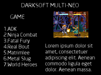
This is what I meant with Alpha paging. Hold B and move stick left/right for page up/down, hold C and move stick left/right for next/previous letter in alphabet. It's very quick for long lists.
 
  • Like
Reactions: rtw
What about something like the default INFO view in Confluence sking in Kodi? There's a list of files/games on the left, a screenshot in the top right, and a description in the bottom right.
 
Last edited:
Due to the small resolution, i would not advice to overload screen with information. Whatever it's shown in the screen should be useable/viewable starting with a 14 inch monitor.
 
I do not really care for a favorite screen. I am used with other mutis to create a folder named Favorites and putting inside all the roms I like the most. The screenshots look very pretty, BTW, but usability on a small screen is a must. I only have a 13" PVM, and no way to get a bigger one, LOL.

Thanks!
 
Due to the small resolution, i would not advice to overload screen with information. Whatever it's shown in the screen should be useable/viewable starting with a 14 inch monitor.
Color coding helps with this. Maybe have the static solid color background or border for each game in the menu. So you still have the game logo in the middle and a thick border around that in RED for fighting games, Blue border for SHUMPS, as so on.

Make each button do something in the menu in addition to the joystick.
 
I'm not really sure if color-coding game genres is the way to go. Seems a bit pointless, or at the very least, unnecessary. Why not just have basic file/folder hierarchy and leave it up to the user to separate games in folders as they will? It's a process that works well enough for Everdrives - asking Darksoft to go through the games one by one and tag each one with a color indicator seems like pretty poor investment of time when you consider just how arbitrarily 'useful' the end result is.

Besides, at the end of the day, all we really want is functionality. Yes, it'd be cool if the menu screen was shiny and whiz-bang gee whillikers awesome...but hardly necessary. Let's get a working menu first before we start pasting glitter on it.
 
What do you guys think of the Kit's menu? As you can see, you navigate with the joystick using the snapshots that you can see for each game. It can get a little bit tricky if you have to navegate over 200+ games, we will see. What do you guys think?
Naaaiceeeee menu !

Hope it can be customized! and the boot splash also could be customized!
 
Why not just have basic file/folder hierarchy and leave it up to the user to separate games in folders as they will?
I agree with this. On the other hand though , the neogeo library is fairly small compared to the everdrive series - so it makes it a bit more feasible. But yeah, all we need is a simple file/folder hierarchy. The aesthetic looks amazing so far
 
What about mapping the four slots to the four controller buttons?

As you scroll through the games you could press A to load games into slot 1, B for slot 2, etc. If a game already exists in that slot you have a popup confirming the overwrite.

Select button to erase/empty a slot, using the corresponding slot buttons mentioned before.
Start button to select which game you would like to play, again with the slot buttons to select the game.

Baring any of that, did you have plans to toggle between games on the fly like multi slot MVS units? If so, how did you plan to replicate this on a consolized MVS or AES unit?
 
Keep it simple. Game list on one side, screenshot on the right. Remember that the resolution of this is 320x240 so there's really not a lot of real estate to work on
 
i would do it more simple, just two options: only logos (like DS screenshot) or only text (but not both at the same time)
 
One thing...menus need to be simple because even 24 point text looks gigantic on a CRT screen. Take a look at a simple mockup with a screenshot, 3 sentences of text, and a game list on the side:
 

Attachments

  • Resolution test.png
    Resolution test.png
    39.6 KB · Views: 264
I kinda skipped through some of the recent screens so maybe this has been answered.

Is there away to set a default game in the menu to load at power-on?

I want to power my cab and have a single game load unless I intercept it on boot up (if possible)... that way I power up my games room and there's not multiple cabs waiting for me to select a game from a menu.

(I know this is a 1st world problem)
 
Status
Not open for further replies.
Back
Top