Edit 3/27/24-
I tweaked them a bit more. The move strip is now Egret sized and I resized the rainy day banner to be 16x11-ish as well as traced the upper text.

Please feel free to tweak, fix, update, modify, print, etc. If you make any fixes please send me a copy of the updated file and I'll add it to the dropbox. With a little bit of work I think we can take these from low quality to high quality. I'm going to keep constantly poking at these (and others) so I may not have the most up-to-date copies in dropbox. Please feel free to PM me whenever and I can toss up the latest version.
Edit 2:
I made some more tweaks to the rainy day sign in rev2. I kept the rev1 stuff in the post for some history. We started off with a low quality repro and I think we've made it into medium quality territory now. I'm moving them from drop box to google drive. I'll get a new link up soon. PM me in the meantime if you want them.
----
I know @Bluetear is working on a pixel-perfect accurate version, but for my basement arcade, I'm okay with a reasonable approximation. I figured I'd try to whip one up myself.
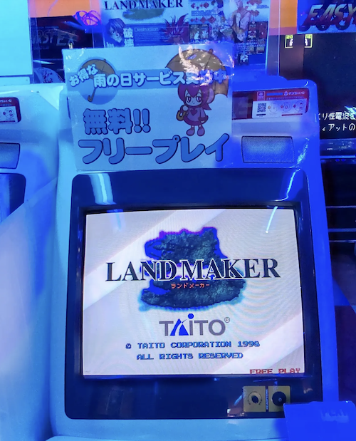
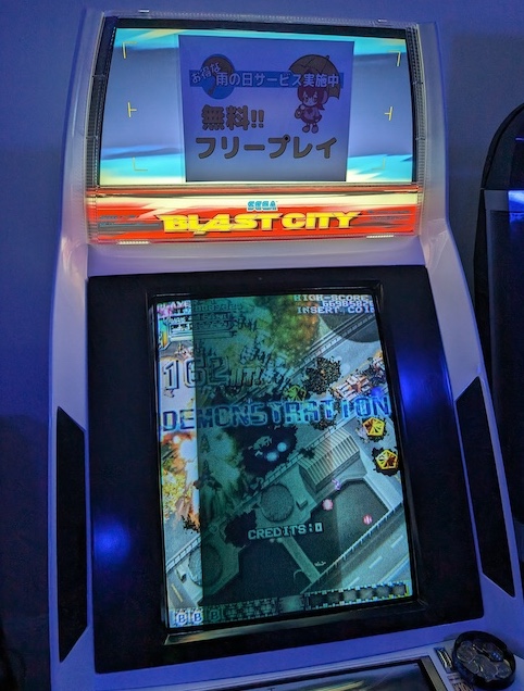
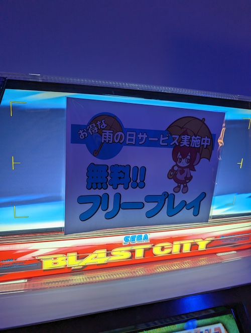
I was only able to find two photos:
this one from https://cohost.org/ywy/post/376629-akihabara-hey-land-m
 .
.
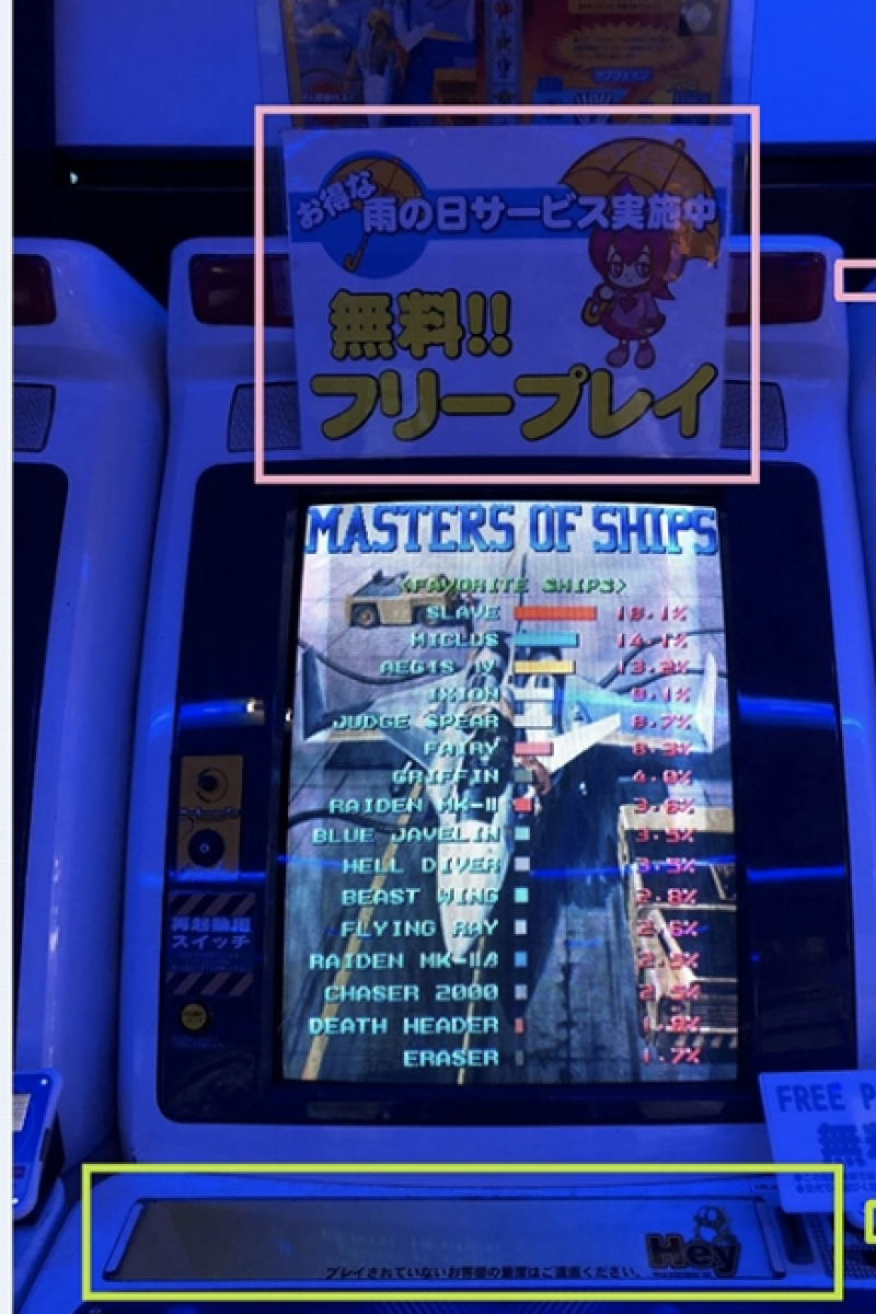
and this one from Bluetear's post https://www.arcade-projects.com/thr...er-control-panel-artwork-reproductions.13918/
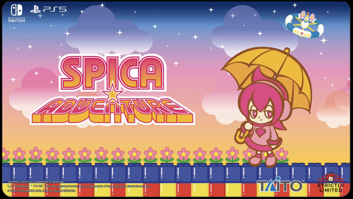
I've been tossing the idea around for a while but I'm not that good with Illustrator and trying to reproduce the umbrella girl would've taken me ages. Well luckily for me Spica Adventure just got announced and Strictly Limited posted a perfect pic that would be easy to trace.
https://twitter.com/RealStrictlyLTD/status/1763610263847162092
There's plenty of more tweaking to be done but here's what I ended up with:
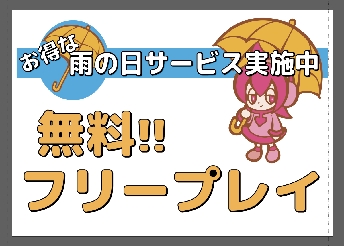
The spacing is wrong, the font is wrong, the sizes are wrong, and the colors are wrong. But that's okay, I needed to start somewhere and something is better than nothing.
I might trace the lettering in the future to create a more accurate font but for now it's fine. I'm using M Plus Rounded Black: https://fonts.google.com/specimen/M+PLUS+Rounded+1c
I think it came out pretty good for a first attempt:
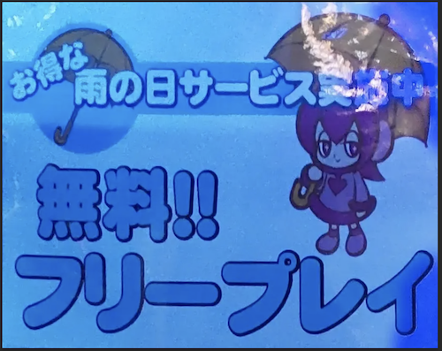
Edit: I decided to try to clean it up and trace the main font--still a WIP but looking good. I'm keeping the smaller text in the generic Mplus for now. I also did a perspective shift on one of the images and used that to get some more accurate placement. The real signs have everything stretched a bit which I didn't see initially.
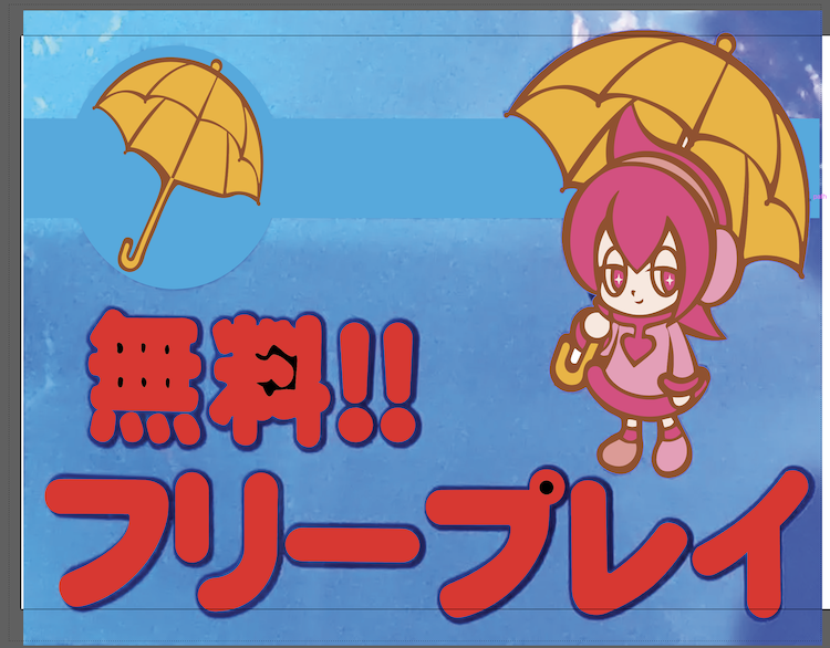
And the new semi-finished product:
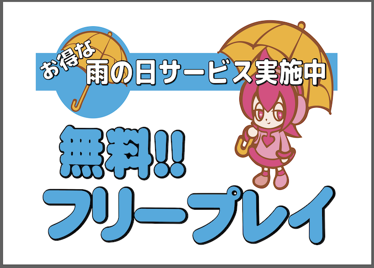
Much better than rev1. I might even say we've progressed to medium quality repros.
I tweaked them a bit more. The move strip is now Egret sized and I resized the rainy day banner to be 16x11-ish as well as traced the upper text.
Please feel free to tweak, fix, update, modify, print, etc. If you make any fixes please send me a copy of the updated file and I'll add it to the dropbox. With a little bit of work I think we can take these from low quality to high quality. I'm going to keep constantly poking at these (and others) so I may not have the most up-to-date copies in dropbox. Please feel free to PM me whenever and I can toss up the latest version.
Edit 2:
I made some more tweaks to the rainy day sign in rev2. I kept the rev1 stuff in the post for some history. We started off with a low quality repro and I think we've made it into medium quality territory now. I'm moving them from drop box to google drive. I'll get a new link up soon. PM me in the meantime if you want them.
----
I know @Bluetear is working on a pixel-perfect accurate version, but for my basement arcade, I'm okay with a reasonable approximation. I figured I'd try to whip one up myself.
I was only able to find two photos:
this one from https://cohost.org/ywy/post/376629-akihabara-hey-land-m
and this one from Bluetear's post https://www.arcade-projects.com/thr...er-control-panel-artwork-reproductions.13918/
I've been tossing the idea around for a while but I'm not that good with Illustrator and trying to reproduce the umbrella girl would've taken me ages. Well luckily for me Spica Adventure just got announced and Strictly Limited posted a perfect pic that would be easy to trace.
https://twitter.com/RealStrictlyLTD/status/1763610263847162092
There's plenty of more tweaking to be done but here's what I ended up with:
The spacing is wrong, the font is wrong, the sizes are wrong, and the colors are wrong. But that's okay, I needed to start somewhere and something is better than nothing.
I might trace the lettering in the future to create a more accurate font but for now it's fine. I'm using M Plus Rounded Black: https://fonts.google.com/specimen/M+PLUS+Rounded+1c
I think it came out pretty good for a first attempt:
Edit: I decided to try to clean it up and trace the main font--still a WIP but looking good. I'm keeping the smaller text in the generic Mplus for now. I also did a perspective shift on one of the images and used that to get some more accurate placement. The real signs have everything stretched a bit which I didn't see initially.
And the new semi-finished product:
Much better than rev1. I might even say we've progressed to medium quality repros.
Last edited:
