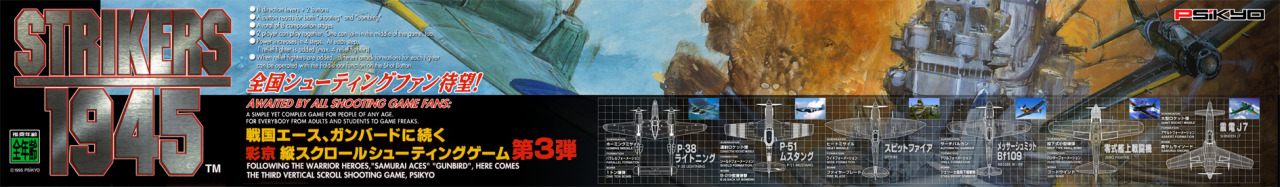
K405
Professional
I like it, its like move strip eye porn!


I like the last one with the extra coloring.Can't decide which background fits better....
NO! It looks great!Work in progress. Looks a little boring maybe..
Looks pretty darn awesome, anyway to make the text on the last 2 vehicles fit inside the circle like the first 2? Maybe make the vehicles a little smaller?Work in progress. Looks a little boring maybe..
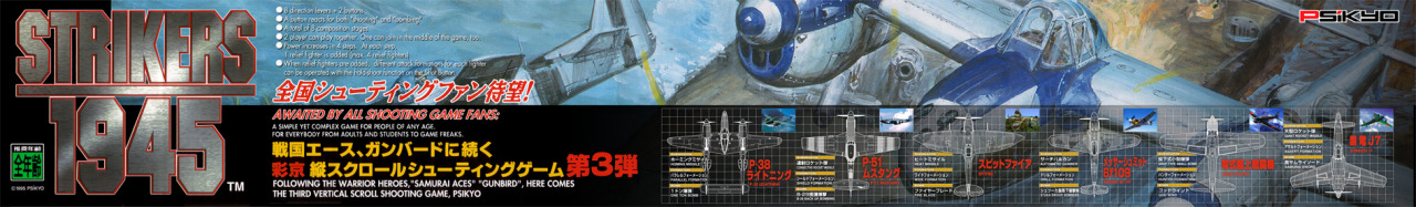
Thats gonna be sweet, I started collecting the entire series, its almost complete. Thanks.Yes I just need to fix the lettering on the circles. That's all there is left to do.
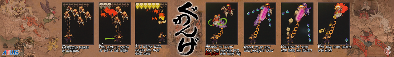
And yes I feel like doing the whole MetalSlug series.


I like the last one! Can you try to incorporate all the elements into one to see how it looks? Make sure to keep the taito logo, it makes it seem more officialI really like the Warning bit, but it's hard to find a good place for it.


")