The Game
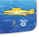
There's a Puzzle Game made by Jaleco on the Cave 68K hardware called Uo Poko, It's like a cross between pachinko and puzzle bobble and quite fun.
View: https://www.youtube.com/watch?v=Kh9-dfZcsrM
100% of the gameplay is performed by pulling the joystick down and releasing. I'd call it a single button game but it does use the joystick (I guess so it feels more like pulling a lever).
The game also originally came with a set of 4 "cat-paw" covers that fit over a normal joystick ball. These of course being obscure and associated with Cave have been hard to find and expensive.
For being probably the cheapest Cave PCB ever made the little cat-paw adapter each tend to get listed for more than the price of the bare PCB... because of course they do.
Thankfully recently @Lions3 got one of these and made a cast to start making reproductions! of course I bought a set: https://shop.lions3.com/products/uo-poko-balltop-cover-reproduction
So of course I bought a full set:

But now I'd like to build a dedicated panel for this... I figured I'd create this thread to see if anyone else is interested and had ideas themselves.
The Controls
Looking at the PCB Manual it specs an 8-way joystick and a start button for each of 2 players. Interestingly despite only using the down direction on the joystick. it does indeed support 8-way operation, with left and right being necessary when adding your name to the high score list and diagonals even being supported (but not necessary) in this mode. Start buttons are used but no other buttons are.
Ok so we've confirmed that we have 2-ball-top 8-way joysticks and 2 start buttons. I can also say that based on the cat-paw they're designed to fit 35mm balls and does not support a shaft cover. I'm using a standard Sanwa JLF with a bare metal shaft, which works nicely.
Weirdly the Instruction cards for this game show a 4-button panel, they don't call out any buttons of course but it is in the imagery and they cleverly try to cover up the buttons in the pictures: http://www.world-of-arcades.net/Cave/Feveron/UoPoko.htm


The Control colors
Both of these also show a red/orange colored ball-top. Interestingly there's a scene in attract mode that shows a profile of an Astro-City-ish cabinet being played with a red/orange ball top also.

I can't find any official references images that show the cat-paws. There was never a red or orange cat-paw, nor would a red or orange ball-top work with anything other than maybe the black cat-paw, but only because black goes with everything.
Perhaps more "official" though is that in-game player 1 during gameplay shows a green ball-top and yellow start button when providing instruction. and player 2 during gameplay shows a pink ball-top and yellow start button when providing instruction (these can be seen in the video linked at the top). These colors bode with the Astro-City default 2P control panel colors (P1 green, P2 pink, and yellow starts).
Pink and Green also match two of the cat-paws included. It's also worth noting that the player avatars in-game have P1 as a yellow cat with green eyes, and P2 as a pink cat.
With that said I think the intended ball colors for the cat paws are likely P1 Green on green and P2 Pink on Pink like this:

The colors seem a direct match
or alternatively P1 Yellow over Green, and P2 black over Pink

This allows the ball tops to match in game while the cat-paws have a matching contrast with the balls, and we're keeping with P1 being the yellow cat with a green eye.
The layout
I think given the Astro-City hints and colors it would make sense to place the yellows start buttons in the center the same as they are on an astro. Then the question is do you also place the joysticks in the normal place, or do you center them for each player. I think if you're going to do a dedicated panel it would make sense to center them, it would make the panels ambidextrous, it would give a good excuse for it being a dedicated panel, and by forcing the player to reach a bit more they'd be clawing at the joystick like a cat, which is funny to me.
The artwork
The last piece of the puzzle not yet figured out. the installation art is all deep blue underwatter featuring either fish or bubbles, which matches the in-game theme as well. I'm honestly not sure what the art should look like but I do think it should match the installation art and instruction strip, as well as the two different cat paw color setups. I'm open to ideas.
There's a Puzzle Game made by Jaleco on the Cave 68K hardware called Uo Poko, It's like a cross between pachinko and puzzle bobble and quite fun.
100% of the gameplay is performed by pulling the joystick down and releasing. I'd call it a single button game but it does use the joystick (I guess so it feels more like pulling a lever).
The game also originally came with a set of 4 "cat-paw" covers that fit over a normal joystick ball. These of course being obscure and associated with Cave have been hard to find and expensive.
For being probably the cheapest Cave PCB ever made the little cat-paw adapter each tend to get listed for more than the price of the bare PCB... because of course they do.
Thankfully recently @Lions3 got one of these and made a cast to start making reproductions! of course I bought a set: https://shop.lions3.com/products/uo-poko-balltop-cover-reproduction
So of course I bought a full set:
But now I'd like to build a dedicated panel for this... I figured I'd create this thread to see if anyone else is interested and had ideas themselves.
The Controls
Looking at the PCB Manual it specs an 8-way joystick and a start button for each of 2 players. Interestingly despite only using the down direction on the joystick. it does indeed support 8-way operation, with left and right being necessary when adding your name to the high score list and diagonals even being supported (but not necessary) in this mode. Start buttons are used but no other buttons are.
Ok so we've confirmed that we have 2-ball-top 8-way joysticks and 2 start buttons. I can also say that based on the cat-paw they're designed to fit 35mm balls and does not support a shaft cover. I'm using a standard Sanwa JLF with a bare metal shaft, which works nicely.
Weirdly the Instruction cards for this game show a 4-button panel, they don't call out any buttons of course but it is in the imagery and they cleverly try to cover up the buttons in the pictures: http://www.world-of-arcades.net/Cave/Feveron/UoPoko.htm
The Control colors
Both of these also show a red/orange colored ball-top. Interestingly there's a scene in attract mode that shows a profile of an Astro-City-ish cabinet being played with a red/orange ball top also.
I can't find any official references images that show the cat-paws. There was never a red or orange cat-paw, nor would a red or orange ball-top work with anything other than maybe the black cat-paw, but only because black goes with everything.
Perhaps more "official" though is that in-game player 1 during gameplay shows a green ball-top and yellow start button when providing instruction. and player 2 during gameplay shows a pink ball-top and yellow start button when providing instruction (these can be seen in the video linked at the top). These colors bode with the Astro-City default 2P control panel colors (P1 green, P2 pink, and yellow starts).
Pink and Green also match two of the cat-paws included. It's also worth noting that the player avatars in-game have P1 as a yellow cat with green eyes, and P2 as a pink cat.
With that said I think the intended ball colors for the cat paws are likely P1 Green on green and P2 Pink on Pink like this:
The colors seem a direct match
or alternatively P1 Yellow over Green, and P2 black over Pink
This allows the ball tops to match in game while the cat-paws have a matching contrast with the balls, and we're keeping with P1 being the yellow cat with a green eye.
The layout
I think given the Astro-City hints and colors it would make sense to place the yellows start buttons in the center the same as they are on an astro. Then the question is do you also place the joysticks in the normal place, or do you center them for each player. I think if you're going to do a dedicated panel it would make sense to center them, it would make the panels ambidextrous, it would give a good excuse for it being a dedicated panel, and by forcing the player to reach a bit more they'd be clawing at the joystick like a cat, which is funny to me.
The artwork
The last piece of the puzzle not yet figured out. the installation art is all deep blue underwatter featuring either fish or bubbles, which matches the in-game theme as well. I'm honestly not sure what the art should look like but I do think it should match the installation art and instruction strip, as well as the two different cat paw color setups. I'm open to ideas.